
7 Non-White Neutrals We Swear By: Beyond the Ordinary Palette
Trends may dance in and out of the design world, but one timeless trend that remains unwavering is the allure of neutral paint colors. Think of them as the blank canvas that sets the stage for your design masterpiece. While whites have their charm, there's a whole spectrum of neutral shades that deserve their time in the spotlight. Let's dive into the world of neutrals that are anything but one-tone wonders.

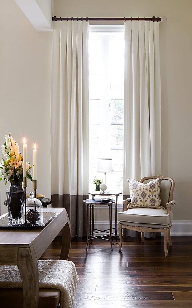
Image Source: Inglis Architects
1. Jockey Hollow Gray by Benjamin Moore
Jockey Hollow Gray by Benjamin Moore adds a touch of green to the neutral palette, introducing a depth that doesn't darken the room. This versatile shade bridges the gap between light and moody, offering a richness that enriches your space without overwhelming it.


2. Pitch Black by Farrow & Ball
For those who adore the drama of moody spaces, Farrow & Ball's Pitch Black is a bold choice. Its richness and depth set the stage for an intense aesthetic. When you're after that touch of artistic intensity, this is the go-to shade.


3. Driftscape Tan by Benjamin Moore
Who says blush can't be neutral? Benjamin Moore's Driftscape Tan defies expectations, offering a warm embrace that pairs beautifully with a range of hues. In a bedroom, it contrasts elegantly with a deep blue upholstered bed, creating a harmonious balance without competing for attention.


4. Ballet White by Benjamin Moore
Ballet White by Benjamin Moore is a warm taupe treasure that breathes light and moody feelings into your space. The secret? Opt for a flat finish, and watch the interplay between sunlight and shadow create an inviting atmosphere.

5. Stonington Gray by Benjamin Moore
Benjamin Moore's Stonington Gray dances between pale gray and soft blue as the light changes. It's a hue of shifting dimensions that suits various lighting moods. The love for it is so strong that it inspired a custom-painted range to match the cabinets.


6. Slipper Satin by Farrow & Ball
Slipper Satin by Farrow & Ball is a beloved color for its subtle charm. Not quite neutral, it's the perfect middle ground. With gentle pigments, it infuses rooms with depth without overpowering them.


7. Pavilion Gray by Farrow & Ball
Pavilion Gray by Farrow & Ball strikes the perfect balance between depth and modern elegance. This gray whispers sophistication, blending seamlessly with a range of palettes. The result? A touch of depth without the chill.


Remember, neutrals are your palette's foundation, a canvas that's anything but ordinary. Dive into the diverse world of non-white neutrals and let these hues transform your spaces into realms of subtle enchantment.
xx Paulina