
Red: The Bold and Timeless Choice
In the world of interior design, there's one color that reigns supreme when it comes to making a statement—red. Vibrant, passionate, and bold, red isn't just a color; it's a design powerhouse that has the remarkable ability to transform any space. This year, Pantone crowned "Viva Magenta" as its Color of the Year for 2023, cementing red's place at the forefront of interior design trends.
But what makes red truly exceptional is its versatility. It isn't confined to making bold statements; it can also play the role of a neutral, seamlessly blending into a variety of design schemes. We're sharing our favorite red paint colors and insights into how and where to best utilize them.


Image Source: Pinterest
Our Insights on Red:
1. Rectory Red by Farrow & Ball - "A Warm Welcome"
Embrace the charm of painting your front door red or interior millwork. Farrow & Ball is the optimal shade. It’s a spin on a classic red—a bit warmer and more elevated.


Image Source: Pinterest
2. Borscht by Sherwin-Williams - "Warm and Intimate"
Favor warm, moody colors like Sherwin-Williams's "Borscht." We love deep, muted colors as a way to create impact and add atmosphere to any space. Using bold colors adds visual depth, so we like to use them in smaller spaces such as powder rooms, mudrooms, laundry rooms, or offices.


Image Source: Pinterest
3. Lost Souls by Tonester Paints
We love Tonester Paints' and "Lost Souls," a dark and saturated burgundy red that adds sophistication to interiors. I usually lean away from vibrant, true reds, as they tend to exude a strong, energetic, and sometimes overly stimulating vibe. Therefore, their use should be carefully considered. Lost Souls, a dark, saturated burgundy red. It’s moody, inviting, and sexy while being sophisticated.


Image Source: Pinterest
4. Redend Point by Sherwin-Williams
We recommends "Redend Point" from Sherwin-Williams's Emerald line for a serene and elegant touch. A delicate and serene color in the red family, that beautifully captures a sense of calmness. It subtly adds a touch of elegance to interiors without overwhelming the space.


Image Source: Pinterest
5. Farrow + Ball Incarnadine
Red is sexy and adds drama to any space. Benjamin Moore’s Heritage Red is a stunning, rich, potent shade. It’s a fabulous color for a statement room like a kitchen.

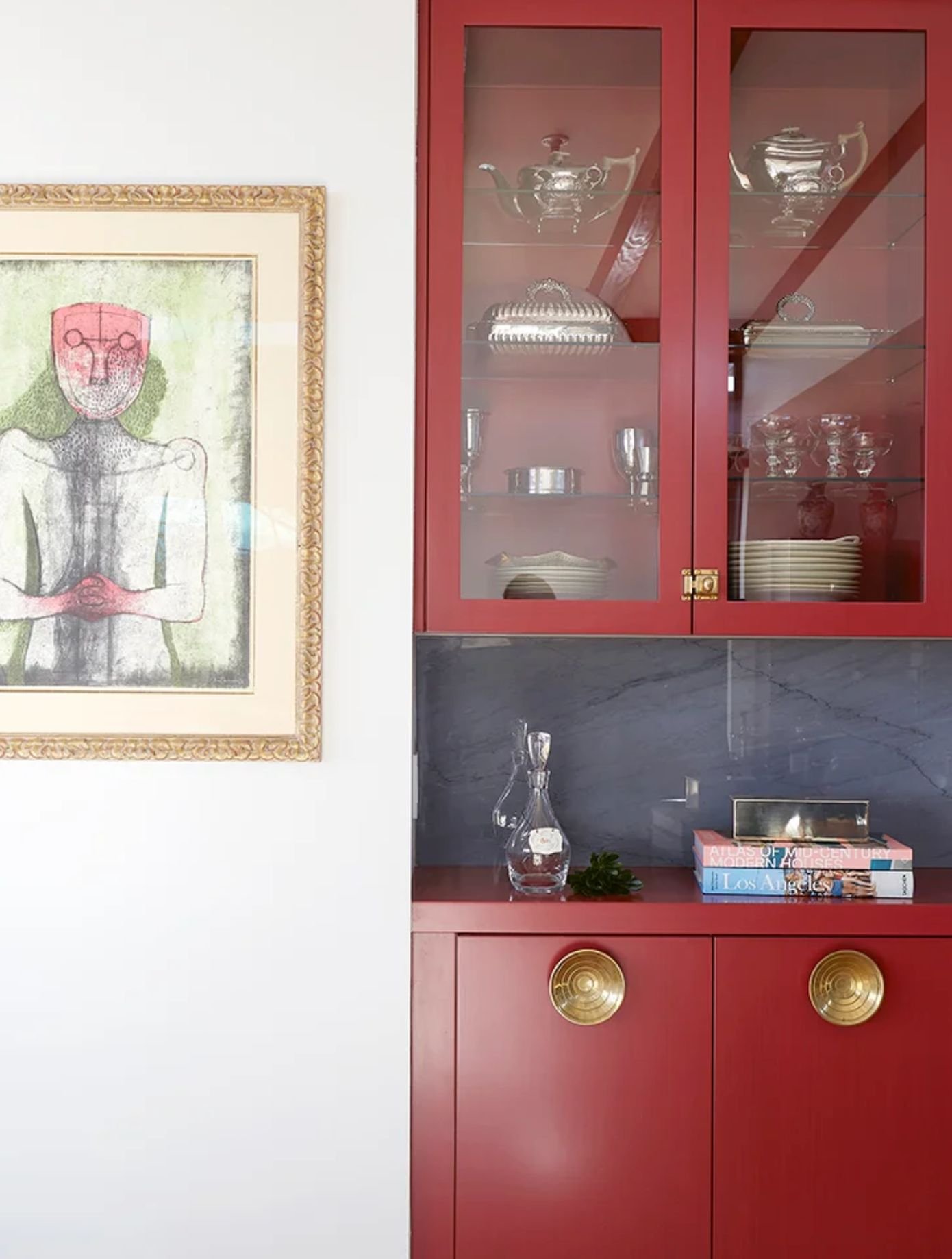
Image Source: Pinterest
Red isn't just a color; it's a design philosophy. It's the bold brushstroke on the canvas of your home, the statement that sets the tone for your living space. With the right shade and application, red can bring warmth, drama, and sophistication to any room.
Don't shy away from this timeless and captivating color—embrace the power of red in your next design project. In the world of design, let red be your guiding star. Illuminate your spaces, captivate your senses, and make a statement that lasts.
xx Paulina